
Your Raise Was a Lie
Statistics Canada says the poorest Canadians got a 35% raise over two decades. Fix three known measurement errors and that number drops to about 10%. For the middle class, it’s worse.

Original Research · 21 Years of Data
March 2026 · After-tax income, 2002–2023
Every year, the government tells you how much richer you’re getting. Your pension goes up. Your tax brackets shift. Your wages get benchmarked. All of it rests on a single number: the Consumer Price Index. That number is wrong. Not by a little. By enough to halve your income gains over the past two decades.
This is not a conspiracy theory. It’s arithmetic. Statistics Canada’s CPI has three well-documented blind spots—in shelter costs, spending-pattern differences across income levels, and healthcare quality. Each one causes the official measure to undercount the actual cost of living. Stack all three, and the official CPI (which reached 155 by 2023 on a 2002 base) should have been closer to 201–216.
That 46–60 point gap between 155 and 201–216 is not abstract. It’s money. It’s 21 years of pensions that were too low, tax brackets that crept too high, and poverty lines that were drawn in the wrong place. It’s the gap between the economy you were told you lived in and the one you actually experienced.
Three Blind Spots, One Broken Number
The CPI determines everything from your CPP cheque to whether the Bank of Canada raises rates. Here’s what it gets wrong:
1 Shelter: A 20-year smoothing trick
Statistics Canada measures homeownership costs by averaging over a rolling cohort of mortgage holders—including people who bought at 2005 prices. This makes the housing crisis invisible in the data. Owned accommodation carries ~16.7% of CPI weight, and the gap between the official measure and alternatives like Owners’ Equivalent Rent or User Cost of Housing is enormous. If you’re trying to buy or keep a home now, the CPI doesn’t reflect your reality.
2 One basket for all: The poor pay more
The CPI uses one average spending basket for all 40 million Canadians. But a low-income family spends 35% of their budget on shelter and 17.5% on food. A high-income family: 33% and 14.6%. Since shelter and food had the highest inflation rates, the official CPI understates inflation most for the people who can least afford it. We built separate CPI deflators for each income quintile using actual spending data.
3 Healthcare: Paying double, waiting double
Per-capita health spending rose from $3,489 to $7,900. Median wait times grew from 16.5 to 27.7 weeks. Canadians are paying more than twice as much and getting measurably worse service. The CPI counts none of this. We monetize the cost of waiting using standard Value of Statistical Life methods—the same approach the government itself uses for regulatory impact analysis.
Each correction alone narrows income gains. Together, they cut them roughly in half.
Apply all three corrections and the official CPI of 155 (2002=100) rises to roughly 201–216 (depending on the shelter method used). That means prices actually rose ~101–116% over the period, not the 55% the official number claims. Every “real” income figure built on official CPI is overstated by the difference.
The Chart the Government Doesn’t Show You
The dashed lines below show the official story—real incomes rising steadily for everyone. The solid lines show what happens when you measure inflation correctly. The shaded gap is money you were told you had but couldn’t actually spend.
Real After-Tax Income: Official vs. Corrected CPI (2002–2023)
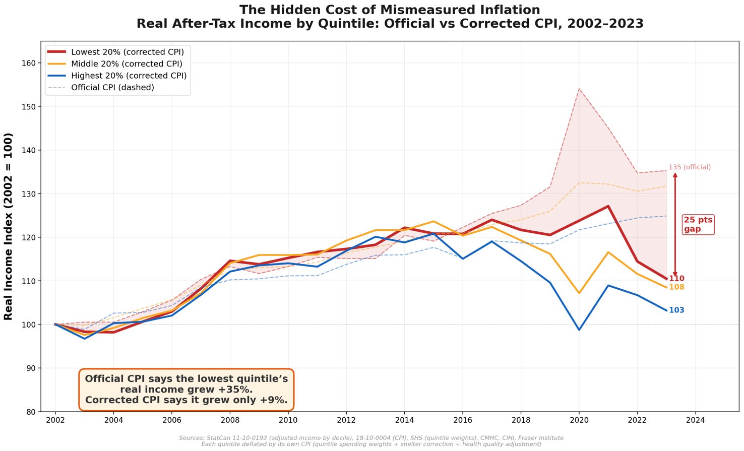
Chart showing official vs corrected real after-tax income by quintile, 2002-2023. Dashed lines show the official CPI picture rising steadily; solid lines show the corrected reality growing more slowly. The gap between them represents overstated purchasing power. Indexed to 2002 = 100. Dashed lines = official CPI deflator. Solid lines = corrected CPI with shelter, quintile-weight, and healthcare adjustments. Shaded area shows the gap for Q1 (lowest income).
After-Tax Income: The Full Damage
These numbers use Statistics Canada’s equivalized income data, deflated by quintile-specific corrected CPIs built from actual spending weights. Every quintile was told their income grew far more than it did.
By quintile
Q1 — Lowest 20% — Official CPI Real Growth: +35.3%; Corrected CPI Real Growth: +10.5%; Overstated By: 26.1 pp
Q2 — Official CPI Real Growth: +35.1%; Corrected CPI Real Growth: +17.1%; Overstated By: 18.0 pp
Q3 — Middle 20% — Official CPI Real Growth: +31.7%; Corrected CPI Real Growth: +8.5%; Overstated By: 24.5 pp
Q4 — Official CPI Real Growth: +29.4%; Corrected CPI Real Growth: +13.1%; Overstated By: 16.3 pp
Q5 — Highest 20% — Official CPI Real Growth: +24.9%; Corrected CPI Real Growth: +3.2%; Overstated By: 22.9 pp
Read that again. The lowest-income Canadians were told their real purchasing power grew by a third over 21 years. The actual number? About a third of that. The highest earners were told +25%. Reality: +3%. The gap is 22 to 25 percentage points across every income group. No one escaped—but the poorest were misled the most.
Market Income: Before Government Steps In
Market income strips out government transfers and taxes—it’s what the economy actually paid you. The picture is even starker.
By quintile
Q1 — Lowest 20% — Official CPI Real Growth: +48.9%; Corrected CPI Real Growth: +28.5%; Overstated By: 20.4 pp
Q3 — Middle 20% — Official CPI Real Growth: +26.3%; Corrected CPI Real Growth: +8.5%; Overstated By: 11.3 pp
Q5 — Highest 20% — Official CPI Real Growth: +25.0%; Corrected CPI Real Growth: +10.4%; Overstated By: 14.6 pp
+8.5%
Middle-class market income growth over 21 years (corrected)
That’s 0.39% per year. Less than 1% per year. Two decades of working harder for very little.
The Technology Illusion: How Cheap Gadgets Hide Slow Growth
There’s a fourth dimension to this story, and it may be the most provocative.
The CPI includes a massive “hedonic” adjustment for technology products. When your laptop gets faster, Statistics Canada counts that as a price decrease—even if you paid the same dollar amount. The digital computing price index fell from 100 to just 14 over this period. Technology products now represent about 9.5% of the CPI basket.
This is methodologically defensible in the narrow sense. But ask yourself: can you pay rent with a faster processor? Can you buy groceries with the quality improvement in your phone? The hedonic deflation in tech products is pulling down the overall CPI, making it look like your cost of living grew less than it did—even though the things you need (shelter, food, healthcare) got relentlessly more expensive.
The question worth asking:
If we strip out technology’s hedonic deflation and ask “how much better off are you at buying the things you actually need to survive?”—the answer is brutal.
After-tax income, corrected CPI, ex-technology
Q1 — Lowest 20% — Official CPI Real Growth: +10.5%; Corrected CPI Real Growth: +7.6%; Overstated By: 2.8 pp
Q3 — Middle 20% — Official CPI Real Growth: +8.5%; Corrected CPI Real Growth: +5.7%; Overstated By: 2.7 pp
Q5 — Highest 20% — Official CPI Real Growth: +3.2%; Corrected CPI Real Growth: +0.5%; Overstated By: 2.6 pp
+0.5%
Highest-quintile real after-tax income growth, ex-tech, over 21 years
+5.7%
Middle-class market income growth, ex-tech, over 21 years
Strip out cheaper gadgets, and the highest-income Canadians barely gained purchasing power over two decades—just +0.5%. The middle class grew barely in market income terms. The poorest quintile’s after-tax gains shrink to 7.6%—still modest across 21 years.
Real After-Tax Income: Corrected CPI, Excluding Technology Hedonic Effects
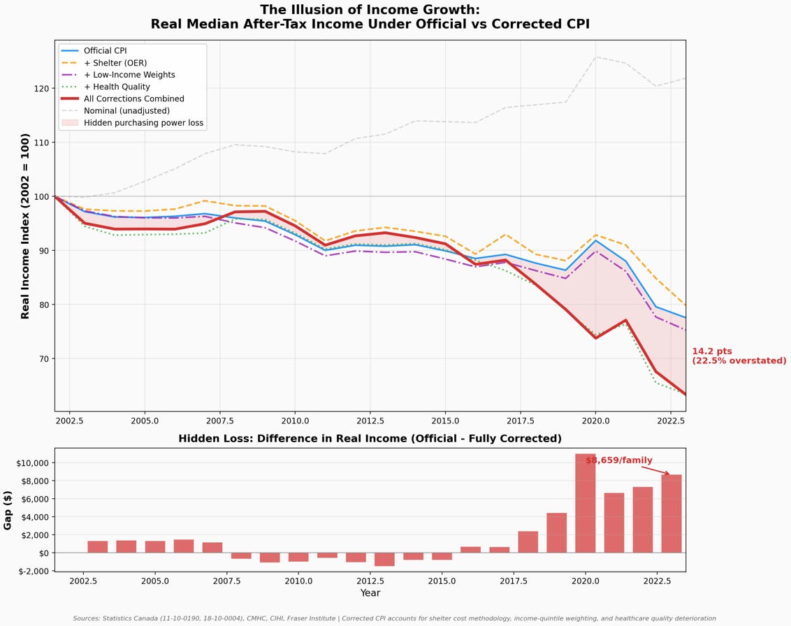
Chart showing corrected real income excluding technology hedonic adjustments. Lines are even flatter, showing modest real income growth once cheaper gadgets are stripped out. Ex-tech variant removes technology hedonic deflation (~9.5% of CPI basket, digital computing index fell from 100 to 14). This isolates purchasing power for non-technology goods and services—the things you need to live.
In plain language: Once you stop counting cheaper laptops and smartphones as a “raise,” the highest earners in Canada barely gained ground—just +0.5% over two decades—and the middle class barely grew. Two decades of GDP growth, and ordinary Canadians got a better phone and not much else.
What This Means For You
This is not just a statistical curiosity. The CPI is wired into the machinery of Canadian life. When it’s wrong, everything downstream is wrong too.
• Your pension is too low. OAS, GIS, and CPP are indexed to official CPI. Twenty-one years of under-indexation means these benefits have quietly eroded by 22–25% relative to actual inflation. For a senior on GIS, that’s thousands of dollars per year in lost purchasing power.
• You’re in a higher tax bracket than you should be. Federal and provincial bracket thresholds are indexed to CPI. Understated inflation means the thresholds didn’t rise enough, silently pushing more of your income into higher marginal rates. You’re paying more tax on less real income.
• You’re waiting longer and paying more for healthcare. Wait times nearly doubled. Spending per capita more than doubled. The CPI says healthcare got 0% more expensive. That’s not a rounding error—it’s a failure of measurement.
• The housing crisis is larger than the data shows. Official shelter inflation is smoothed by two decades of legacy mortgages. For anyone who bought a home after 2015—or is trying to—the real cost increase is far larger than Statistics Canada reports.
• The “productivity puzzle” is a measurement artifact. Economists ask why Canadians don’t feel richer despite GDP growth. They’re asking the wrong question. Canadians don’t feel richer because they’re far less rich than the numbers say. The deflator was wrong.
Methodology Notes
The healthcare quality adjustment uses Value of Statistical Life methodology ($7.5M VSL, 10% population share)—standard in regulatory economics but sensitive to parameter choices. Income data is equivalized (adjusted for family size). City-level effects are much more severe, particularly in Vancouver and Toronto.
Even halving the healthcare adjustment, the gap between official and corrected CPI remains significant—still large enough to fundamentally change the story of Canadian living standards. The shelter and quintile-weighting corrections alone, without any healthcare adjustment, still substantially reduce reported income gains.
The ex-tech variant is not a “correction” in the same sense as the other three dimensions—hedonic adjustment for technology is methodologically sound. It is presented as a diagnostic: how much of your apparent income growth came from cheaper gadgets rather than improved purchasing power for necessities?
The Bottom Line
For 21 years, official statistics told Canadians a comforting story: real incomes rose 25–35%, the poorest gained the most, and the system was working. The corrected data tells a different story entirely.
Real after-tax income growth was 3–10%, not 25–35%. The gap—22 to 25 percentage points—was consumed by shelter costs the CPI smoothed away, healthcare that got worse while getting more expensive, and price increases that hit low-income Canadians hardest.
Strip out cheaper technology, and the highest earners barely gained ground—just +0.5%. The middle class barely grew. Even the poorest quintile—the group the official data says did best—gained just 7.6% over two full decades.
The question isn’t whether Canadians feel poorer than the numbers say they should. The question is why we keep using numbers we know are wrong.